21 views8 copies
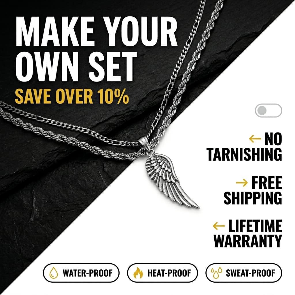
Auranova Men's Chain Set — Diagonal Split Benefit Callout Ad
Prompt
A bold, masculine, diagonal-split advertisement with the upper-left triangle showing silver chain necklaces with a pendant on a dark textured background with a headline and discount line, and the lower-right triangle in white featuring benefit callouts with arrow pointers and three rounded-pill durability badges at the bottom. The overall aesthetic is bold, direct-response, masculine, and durability-focused. DIAGONAL SPLIT LAYOUT — FULL FRAME: The frame is divided diagonally from approximately the upper-right corner to the lower-left corner, creating two triangular sections. The dividing line is clean and hard — a precise diagonal cut. UPPER-LEFT TRIANGLE — DARK PRODUCT SECTION: The upper-left triangular area is filled with a dark, moody product photograph on a textured surface. The background/surface is a dark charcoal-black (#0D0D0D) slate or stone texture — rough, matte, with visible micro-texture suggesting natural stone grain, slight scratches, and mineral variation in very dark tones (#1A1A1A to #0A0A0A). The texture reads as raw, industrial, and masculine. Product — chain necklaces and pendant: Two to three silver-toned (#C0C0C0 to #E0E0E0) chain necklaces are draped across the dark surface, cascading from the upper-left area downward toward the center of the frame. The chains are different styles: one is a thick rope chain (approximately 4mm width) with a twisted, spiral rope texture catching highlights along each curve. Another is a slightly thinner curb or figaro chain. Both are polished stainless steel or white gold tone, with bright specular highlights where the studio light (from upper-left, approximately 45°) catches the rounded chain links — each link glints with a small, sharp highlight. At the junction where the chains converge (approximately center of frame), a pendant hangs — a detailed silver (#D8D8D8) angel wing pendant approximately 1.5 inches long. The wing is intricately sculpted with individual feather details — layered, overlapping feathers tapering to a pointed tip. The pendant catches dramatic studio lighting, with bright highlights along the feather ridges and deeper shadows in the crevices between feathers. Headline (overlaid on dark area, upper-left): "MAKE YOUR OWN SET" in extra-bold, heavy-weight, all-caps sans-serif in white (#FFFFFF), large-scale, left-aligned, stacked across three lines — "MAKE YOUR" / "OWN SET". Below: "SAVE OVER 10%" in bold, all-caps sans-serif in gold (#FFD700) — the gold accent creates a luxury emphasis on the savings. The white headline text is legible against the dark textured background with no shadow needed. LOWER-RIGHT TRIANGLE — WHITE BENEFIT SECTION: The lower-right triangular area is filled with clean white (#FFFFFF) — flat, smooth, no texture. This section contains text-based benefit callouts and feature badges. Benefit callouts (arranged vertically on the right side): Three benefit callouts positioned in the white area, each consisting of a bold text label and a small gold (#FFD700) arrow pointing left (toward the product): Callout 1 (approximately 45% from top, right 50-85%): A small gold arrow (→ but pointing left ←) approximately 25px, followed by "NO TARNISHING" in bold, all-caps, heavy-weight sans-serif in near-black (#0D0D0D), stacked across two lines. Callout 2 (approximately 58% from top, left 25-55%): A small gold arrow pointing right (→) approximately 25px, followed by "FREE SHIPPING" in bold all-caps in near-black, stacked. This callout is on the left side of the white area. Callout 3 (approximately 68% from top, right 50-85%): A small gold arrow pointing left (←), followed by "LIFETIME WARRANTY" in bold all-caps in near-black, stacked across two lines. The alternating left/right positioning of callouts with alternating arrow directions creates a visual zigzag pattern that draws the eye through all three benefits. DURABILITY FEATURE BADGES — BOTTOM 12% OF FRAME: Three rounded-pill badges arranged in a horizontal row at the bottom of the white section, evenly spaced across approximately 80% of the frame width. Each badge is a rounded-rectangle with a thin (1.5px) border in near-black (#0D0D0D), no fill (white background), approximately 130px wide and 40px tall, with fully rounded ends. Inside each badge: a small icon in gold (#FFD700) on the left, followed by the feature name in bold, small, all-caps sans-serif in near-black: Badge 1: A water droplet icon in gold, then "WATER-PROOF" Badge 2: A flame icon in gold, then "HEAT-PROOF" Badge 3: A droplets/sweat icon in gold, then "SWEAT-PROOF" The three badges communicate that the jewelry is built for daily wear — no need to remove for workouts, showers, or outdoor activities. SMALL UI ELEMENT — RIGHT SIDE (approximately 35% from top, right 80-88%): A small, minimal, rounded-rectangle toggle or button outline in light gray (#C0C0C0), approximately 30px wide and 15px tall — resembling a mobile toggle switch or a minimal UI detail that suggests the "make your own set" customization interface. Subtle and decorative. COLOR PALETTE: Near-black dark section (#0D0D0D), dark texture variation (#1A1A1A), white section (#FFFFFF), gold accent/arrows/icons/savings text (#FFD700), silver chains (#C0C0C0 to #E0E0E0), silver pendant (#D8D8D8), near-black text (#0D0D0D), light gray UI element (#C0C0C0). TYPOGRAPHY: "MAKE YOUR OWN SET" is extra-bold, heavy-weight, all-caps sans-serif in white. "SAVE OVER 10%" is bold all-caps sans-serif in gold. Benefit callouts (NO TARNISHING, FREE SHIPPING, LIFETIME WARRANTY) are bold all-caps heavy-weight sans-serif in near-black. Badge labels are bold small all-caps sans-serif in near-black. The entirely sans-serif, all-caps system is masculine, bold, and direct — no serifs, no softness, just confident claims. The overall composition feels like a high-converting men's jewelry DTC ad for Instagram and Facebook — the diagonal split is a dynamic, attention-grabbing layout that breaks the typical grid format, and the dark/light contrast creates visual drama. The dark textured area sells the product's aesthetic (premium, masculine, edgy), while the white area sells the product's functional promises (durability, warranty, free shipping). The "MAKE YOUR OWN SET" customization angle encourages higher AOV by letting buyers choose their chain + pendant combination. The durability badges address the #1 concern with affordable men's jewelry (will it last?). The overall mood is bold, confident, and masculine-premium — positioning Auranova as a modern jewelry brand that delivers luxury aesthetics with everyday durability. The near-black (#0D0D0D), gold (#FFD700), and white (#FFFFFF) palette is the quintessential luxury-masculine color scheme — dark for edge, gold for premium, white for clean communication. High resolution, studio-lit product photography of silver chains on dark textured surface composited in diagonal split layout with white graphic benefit section, social media direct-response ad format, 1:1 square aspect ratio.
AI Model
Nano Banana 2
Category
FashionSubmitted by
Martin
@martinvarto